To date, (I believe) I have done all the artwork for all of the Rogue North Hash House Harriers annual Pink Dress events.
The Hash House Harriers are a non competetive “running” club. Often called “a drinking club with a running problem.” The traditions date back to 1938 in Kuala Lumpur, Malaysia. The concept is “hound and hare” with a designated “hare” laying a trail for the pack to follow to (hopefully) cold refreshments and fun. There are well over 2000 kennels worldwide. The Rogue North is an offshoot of the Lehigh Valley Hash House Harriers that formed in 2017. You can google all that and more if you need to dig deeper.
One of our founding members is a breast cancer survivor and wanted to organize an annual event to raise money for community members going through treatment. Because it sucks.
So every October we gather with 50-60-ish of our friends and dress in our finest thrift store pink dresses to act like fools chasing a hare for libations and donations.
This post is to show you the evolution of this years graphic.
Once I get some ideas from the others I start to scribbling. The prompt I was given was “lady liberty.” Naturally there was to be a pink dress. I wasn’t sure whether to have Yolonda (the bowling ball) held high in place of the torch or a beer. Maybe a mug? Maybe a pint? The Beer won and Yolonda fits just fine in arm. Sunglasses? An eyepatch? Should she be standing on a pallet of Hamm’s beer? This is the stage where I hammer out that general composition.

There were a few other scribbles that are not worth digging out of the trash. This was the settled idea. So I photoshopped some color just to get an idea of the balance. Yolonda has had a pink wig for a while now but she was a natural blonde. The pink wig was just too much with the Liberty dress. So the blonde made a comeback as I felt it helped complement and balance the beer color.

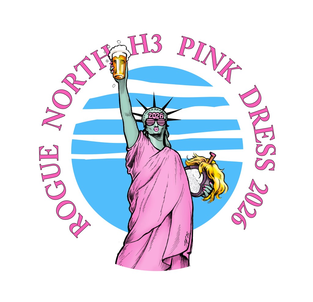
I am still not sure at this point about fonts and background colors. I just knew that I wanted a circle motif. Messing around I felt the blue sky helped the figure stand out better.

Now it is time to get serious…
I gather up some reference materials: Statue of liberty images, google pint glasses, Yolonda pics, etc. and get to better scribbles.
Here are the final pencils after settling on the shades, puckered lips (duckface?), and a little more of a sassy bend in the body.
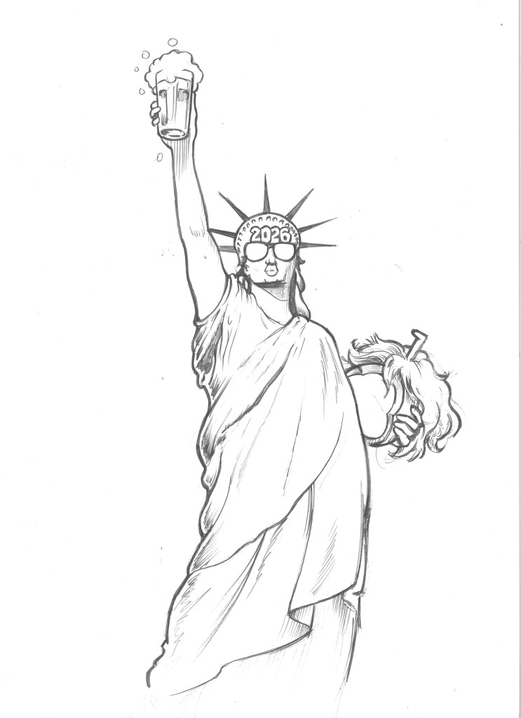
I got out the brush and markers even though I thought about just using the pencil sketch as the base…

I could have gone either way. There was a little doctoring / cleanup in photoshop.
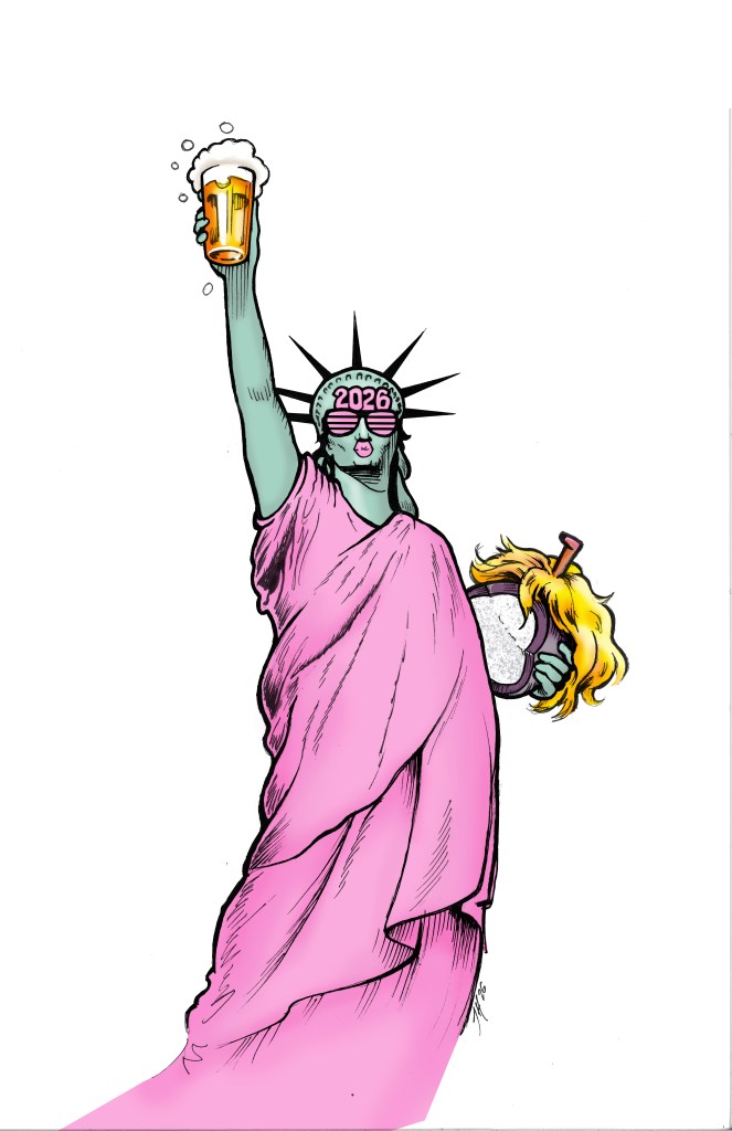
I was happy with the colors. Just wish I could incorporate more of the body length in the final image. Some of this was going to get cropped.
I kept in as much as I could. Then opened the file in Adobe Illustrator to add the blue and white circle and the text. Decided to go with a different font that didn’t look so “modern.” I don’t remember if I added the pink nails in Illustrator or photoshop.
Enjoy!


Leave a Reply